EN
EN

What is the role of laser technology in anti-counterfeiting foil development?
2026/09/11
See how UV and femtosecond lasers write covert codes into anti-counterfeiting foils, plus CO2 demetallization limits and real-time process control.
2026/08/27

2026/08/27
At a recent print exhibition visit in Korea, one point stood out clearly: premium packaging foil effects are rarely judged by technical specifications alone. Buyers respond first to what they can see, compare and understand in a few seconds. Metallic reflection, relief texture, color contrast and a finished-packaging context all help turn a material sample into a practical purchasing conversation.
For GL Foils, the visit was primarily a market-observation exercise. Rather than treating the exhibition as a catalogue of competitor products, we focused on how packaging effects were presented and how visitors were guided from an initial visual impression to a clearer understanding of application, selection and brand value.

Across premium print and packaging displays, the strongest first impression often came from the combination of metallic surface, visible texture and deliberate color contrast. A foil effect became more memorable when it was shown as part of a complete design rather than as an isolated material swatch. This matters for projects such as gift cartons, cosmetic packaging, wine and spirits packaging, book covers and other applications where shelf presence and brand expression are important.
The practical lesson is not that every package needs a brighter finish. It is that the visual role should be defined early: should the foil create a refined metallic accent, a high-contrast focal point, a textured decorative layer or a more collectible presentation? Once the role is clear, the artwork, substrate and process route can be discussed more efficiently.
Material displays were more useful when they showed where an effect could live on a finished item. A buyer can understand a foil surface much faster when it is connected to a packaging panel, a book cover, a gift box or another relevant format. This application-led approach reduces the gap between a sample roll and a real purchasing decision.
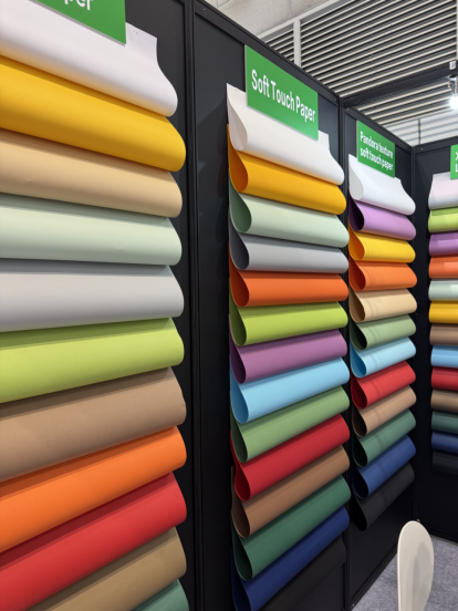
For packaging teams, the most useful discussion is usually not simply 'Which color is available?' It is 'What will this effect do on our artwork and surface?' A practical review should consider the intended substrate, background color, image scale, fine-line detail, stamping or cold-foiling process, and the desired visual result. These are the details that help a supplier and buyer narrow the selection before sampling.
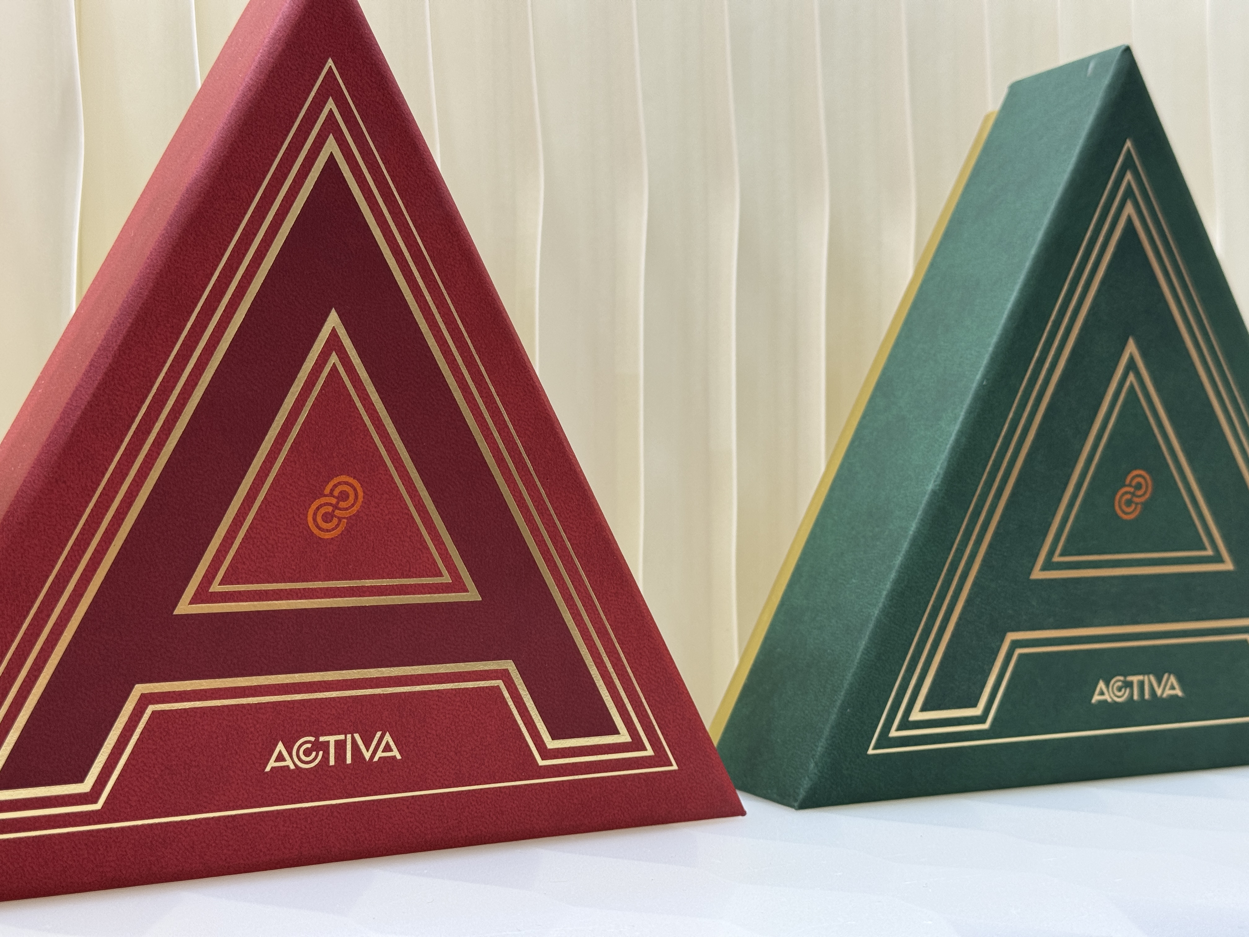
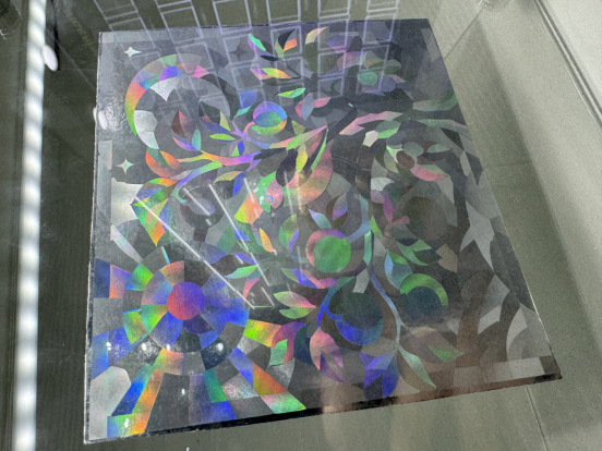
Close-up material samples were especially effective because they made reflection, texture, pattern scale and edge definition visible at a realistic viewing distance. When a visitor can compare a detailed effect with a completed packaging application, the conversation becomes more specific: where should the highlight sit, how strong should the contrast be, and which details need to remain clear after transfer?
This observation reinforces an important principle for packaging material communication: use real samples and accurate close-ups wherever possible. They do not replace technical discussion, but they help buyers ask better technical questions and make the next sampling step more focused.
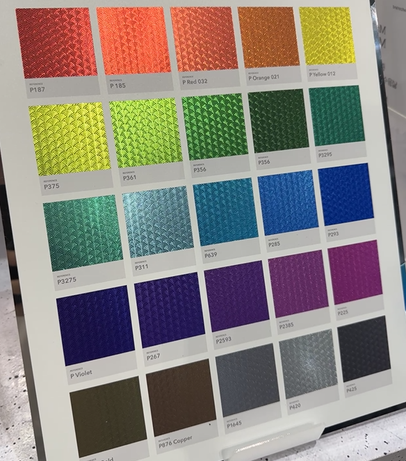
A well-organized color presentation does more than show a wide palette. It gives buyers a fast way to compare tone, finish and visual direction, while also making the supplier's product system easier to remember. In premium packaging projects, a color card works best when it connects the foil sample with the intended application and the questions that affect final appearance.
For GL Foils, this means continuing to improve the way product information is organized around substrate, application and visual effect. Clear product pages, real product images, appropriate color references and relevant examples can help overseas buyers move from general inspiration to a more informed inquiry.
When a visual effect has passed the first review, the next useful step is to define the sample brief. Packaging buyers should specify the substrate type and coating, base color, artwork area, minimum line or text detail, planned printing and foiling process, expected production speed, and final converting steps such as lamination, varnishing, embossing or folding. They should also state whether the priority is metallic brightness, subtle diffraction, registration accuracy, scratch resistance or consistency across a long run. A brief built around these variables allows suppliers to screen options before sending samples, reduces irrelevant trials and makes feedback more comparable. It also separates a promising exhibition impression from a foil direction that can be evaluated under real production conditions.
The Korea exhibition visit confirmed that material presentation is part of product communication. For future website and sample-support work, GL Foils will continue to strengthen real close-up imagery, application-led product information and clearer selection paths for packaging buyers. The goal is to make it easier for customers to explain their substrate, process and desired finish, so that the first discussion is more relevant and the sampling process can start with better information.
If you are developing a premium packaging project, share the substrate, artwork, printing background, application method and required effect with our team. We can then discuss a suitable foil direction and sampling route for the project.
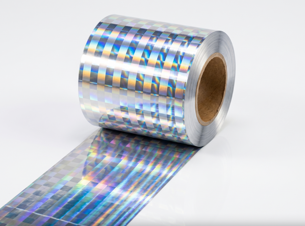
2026/09/11
See how UV and femtosecond lasers write covert codes into anti-counterfeiting foils, plus CO2 demetallization limits and real-time process control.

2026/09/11
Hologram foil uses electron beam lithography, kinematic holography, dot matrix diffraction, and nanofabrication for secure high-definition packaging.
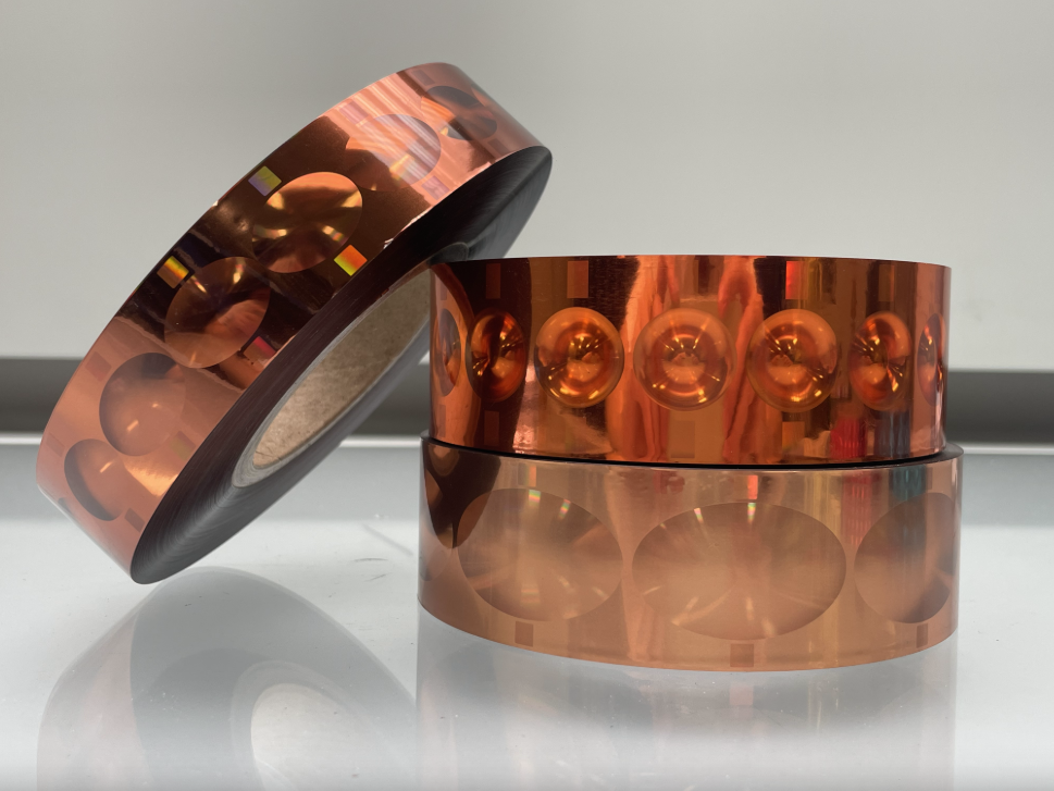
2026/09/11
See how light shifts color and motion, adding secure visual effects that resist copying on printed cartons and retail labels for brands worldwide today.
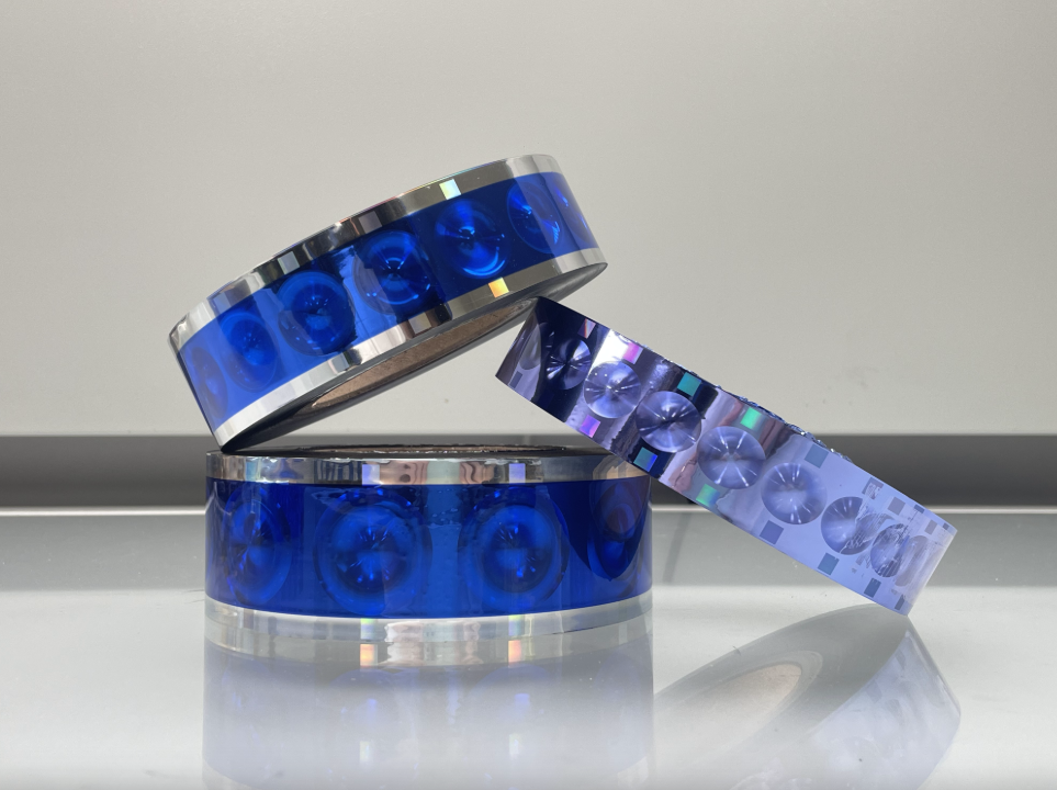
2026/09/11
Security holograms and holographic labels add overt protection. Learn optics, foil, design, pitfalls, limits, and fake risks in real world use.
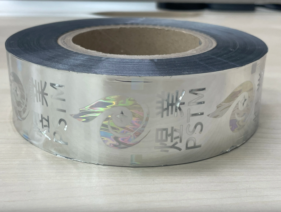
2026/09/11
Learn how metal decoration works without heated dies, plus substrate limits and inline setup costs, quality control and output plans for packaging lines.
2026/09/11
Hot stamping foil uses heated dies; metallic ink prints via a printing process. Compare brilliance, adhesion, rub resistance, cost, substrate for decoration